Mobile UX/UI
Overview
What is the problem?
As cities rapidly grow in population, there has been growing interest in counteracting the negative climate effects of global urbanisation by making cities greener, car free and easier to navigate.
As cities rapidly grow in population, there has been growing interest in counteracting the negative climate effects of global urbanisation by making cities greener, car free and easier to navigate.
Micromobility solutions such as bike sharing apps are being created all around the world but the issue is a lot often make key information like cost of riding, breadth of coverage and methods of securing a bike incredibly vague or unclear. Damaging the user experience and putting potential users off.
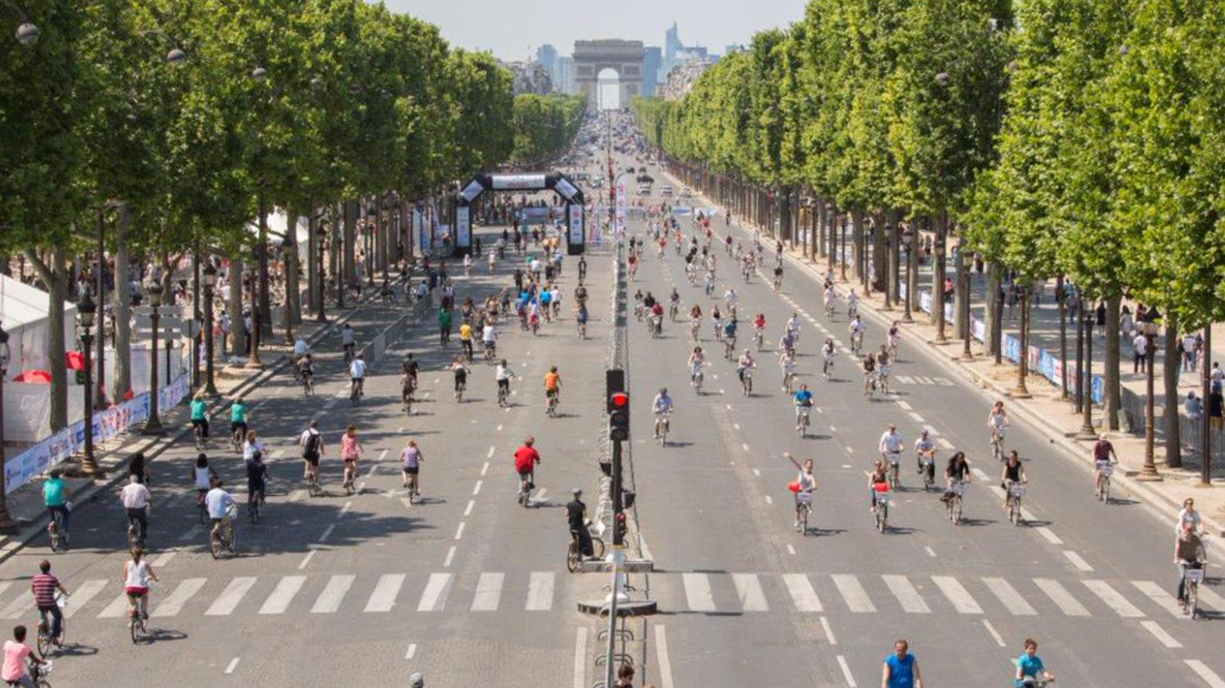
Image of a car free Paris
Understanding current user experiences
The first step in the design process was to develop an understanding of people's current experiences with micro-mobility apps.
These discussions were facilitated by the use of an adapted business model canvas made on Miro and were based around 5 key questions, which encouraged participants to discuss their previous experiences with and feelings towards bike and scooter sharing app use:
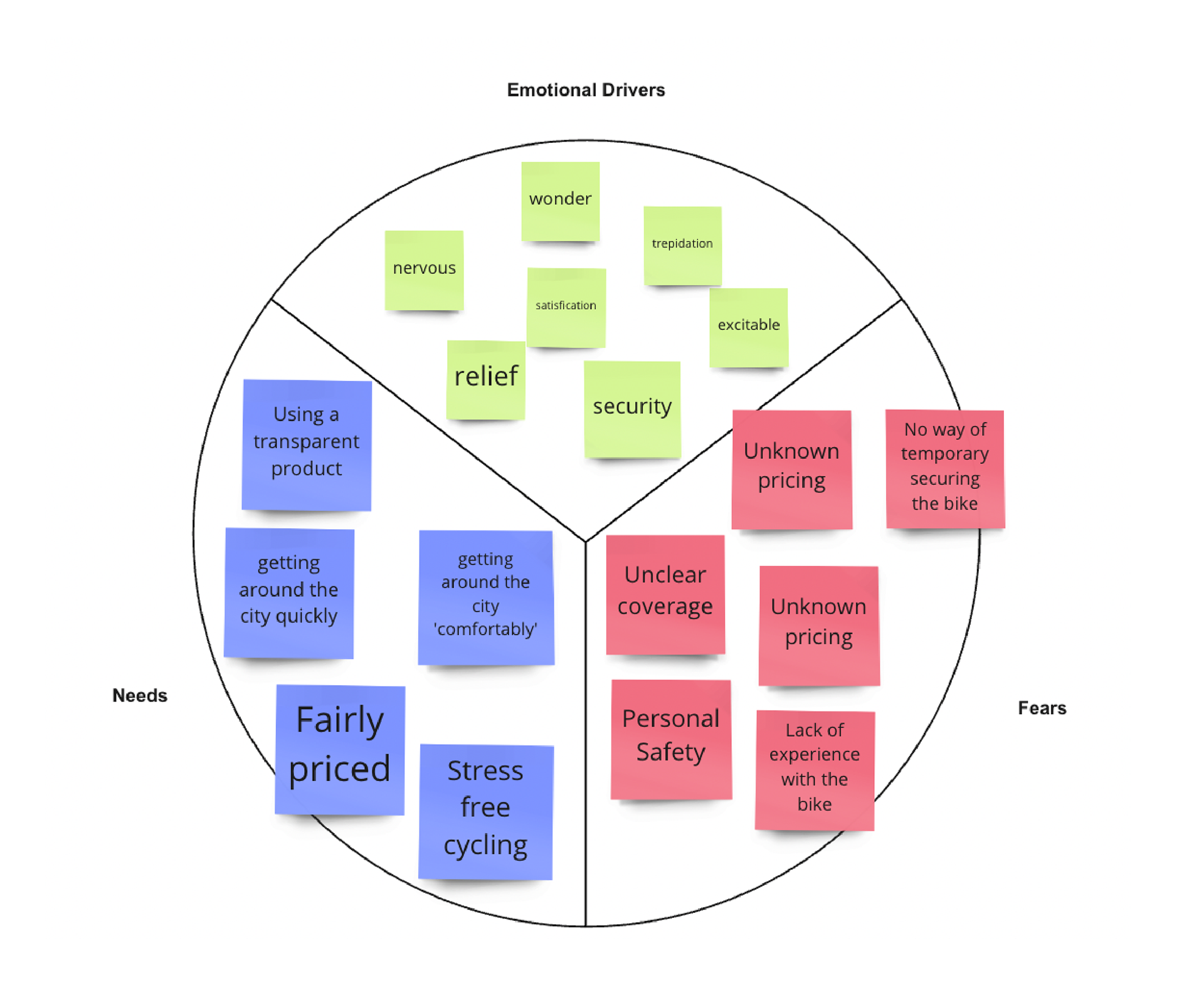
Notable takeaways from these conversations included:
- stories of being charged an unexpected amount for a ride
- getting late fees because they did not properly secure the bike
- feeling uncomfortable in the sign up process as they felt like they had to give up too much information just to use it.
Notable takeaways from these conversations included:
- stories of being charged an unexpected amount for a ride
- getting late fees because they did not properly secure the bike
- feeling uncomfortable in the sign up process as they felt like they had to give up too much information just to use it.
Setting the brief
After establishing an initial understanding of user's experience, the brief was set to "Focus on improving the transparency and clarity the Onboarding and Unlocking flow of a bike sharing app", and see how bike sharing can be made more transparent and clear for users.
Objectives
To guide the design process and achieve the brief, three overarching objectives were set which were:
- To make the onboarding and cost transparent to the user
- To allow the user to access relevant information of their ride without swiping
- To develop a solution that encourages users to bike hire over alternative options such as Uber or Train.
Capturing User's Needs and Wants
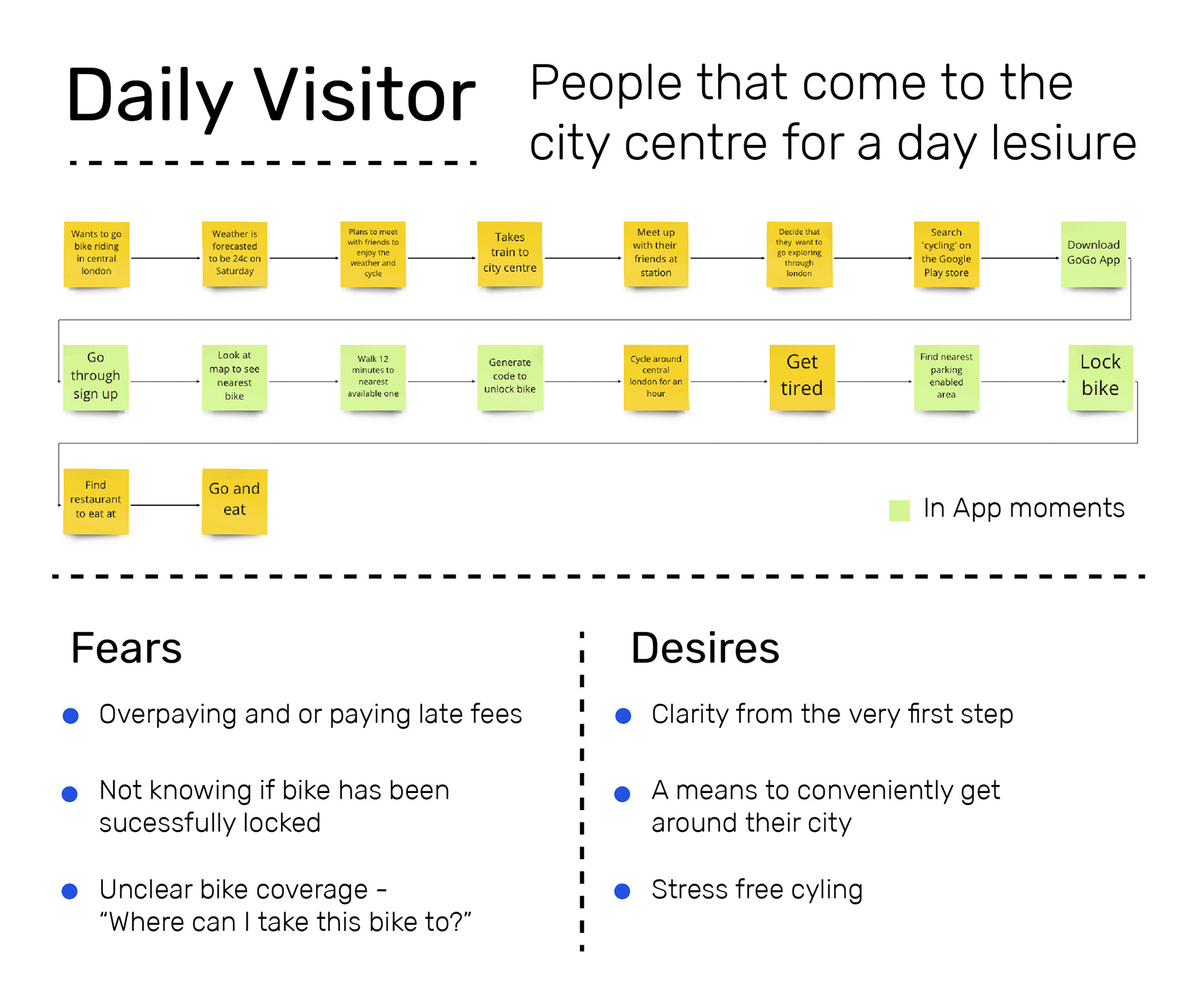
Forming a User Persona
Using the insights gathered from the adapted Business Model Canvas, I started to create a persona based on the patterns that I had identified in research. Due to the relatively short time for the project, I thought it would be best to focus on a singular persona's wants and fears.
I opted against using pictures, stating gender, age groups, income and instead focused on building detail into the habits and motivations of the user group.
This is not something I have done before but I thought it would be interesting to see the result, as at times I believe personas can actually lose the key details of their user group by focusing on perhaps more arbituary qualities of the users they are trying to reach.
Using Value Proposition
Identifying what the competitors in the market offered, provided the platform to think about how GoGo could fill the gaps and provide value. Key points picked up during analysis were:
Lack of transparency and clarity in pricing
For new users, confusion in what areas are covered for parking
Sign up processes are not straightforward
Lack of flexibility in pricing options and plans i.e student friendly plans
Lack of transparency and clarity in pricing
For new users, confusion in what areas are covered for parking
Sign up processes are not straightforward
Lack of flexibility in pricing options and plans i.e student friendly plans
Designing the User's Journey through the flows
Information Architecture
I first recreated other bike sharing apps such as Lime and Santanderbike to see from a top down view how they structured their apps and what features were involved, using this as a benchmark for GoGo’s structure. This was extremely helpful as I was able settle on how I wanted the content of GoGo to be organised before getting into more detail around how users would make their way through different flows.
I first recreated other bike sharing apps such as Lime and Santanderbike to see from a top down view how they structured their apps and what features were involved, using this as a benchmark for GoGo’s structure. This was extremely helpful as I was able settle on how I wanted the content of GoGo to be organised before getting into more detail around how users would make their way through different flows.
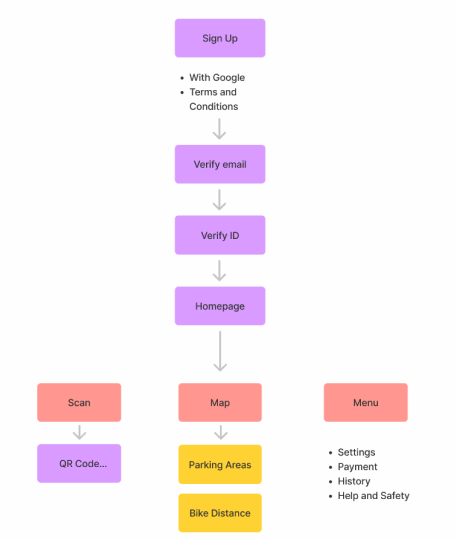
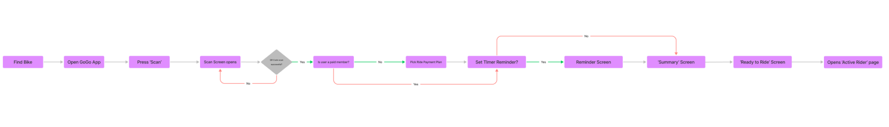
User Flows
Figuring out how I wanted the user to progress through Onboarding and Unlocking bike flows. This was done after studying the flows of multiple other apps that I believed worked as analogous examples. This was key as one of the project objectives was to make a transparent app, therefore the sign-up flow had to feel intuitive and easy to follow.

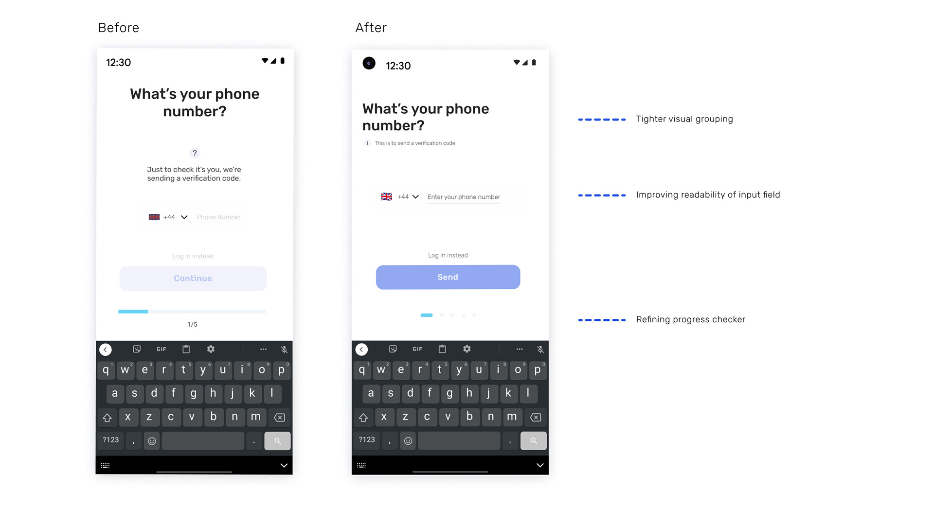
Developing Wireframes
The set of wireframes I created before these, were not up to standard. Having shown them to my design mentor for feedback a key detail was mentioned which was the lack of detail. Whilst visually they do not need to be detailed, they should still be able to communciate what the function of the screen is, with limited explanation.
Based of this I revised my wireframes to be clearer conceptually.
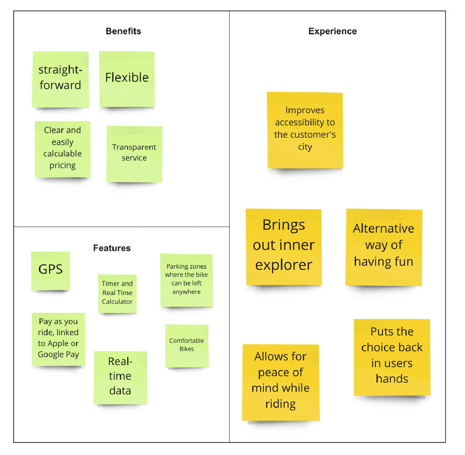
Key Features
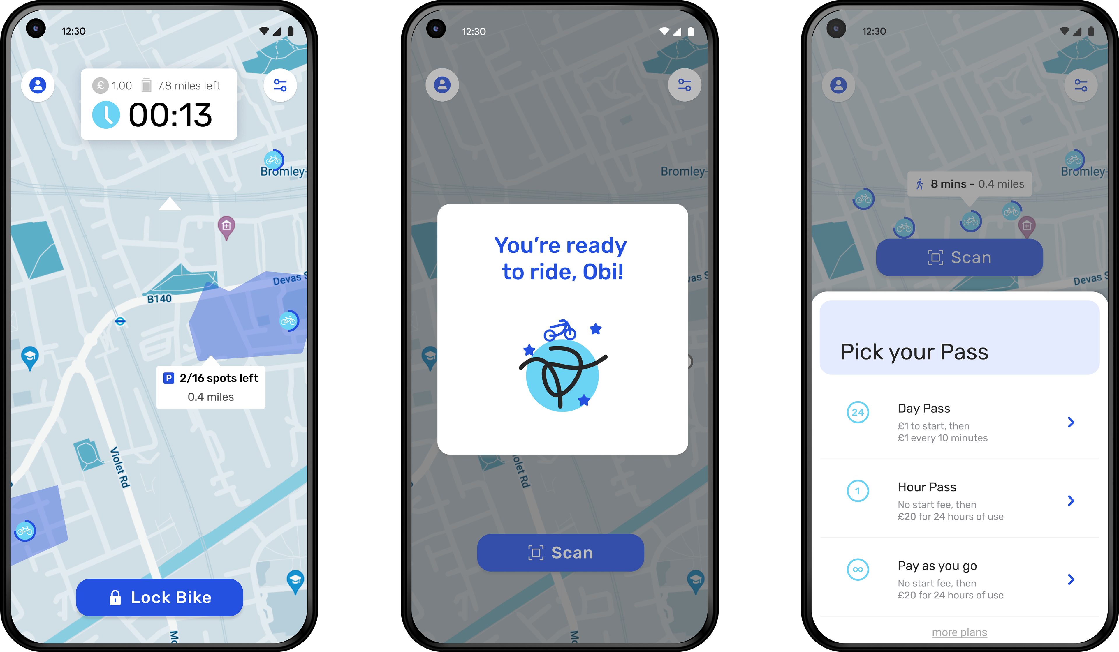
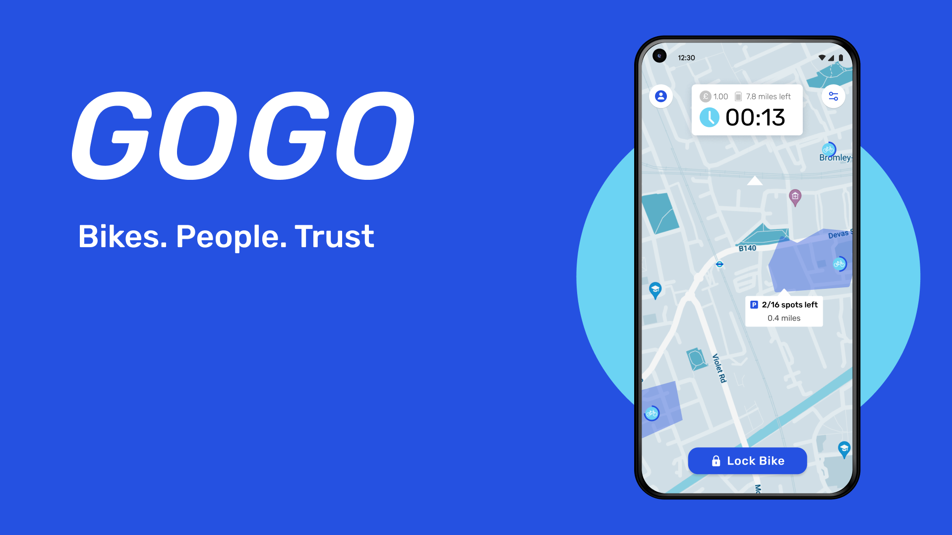
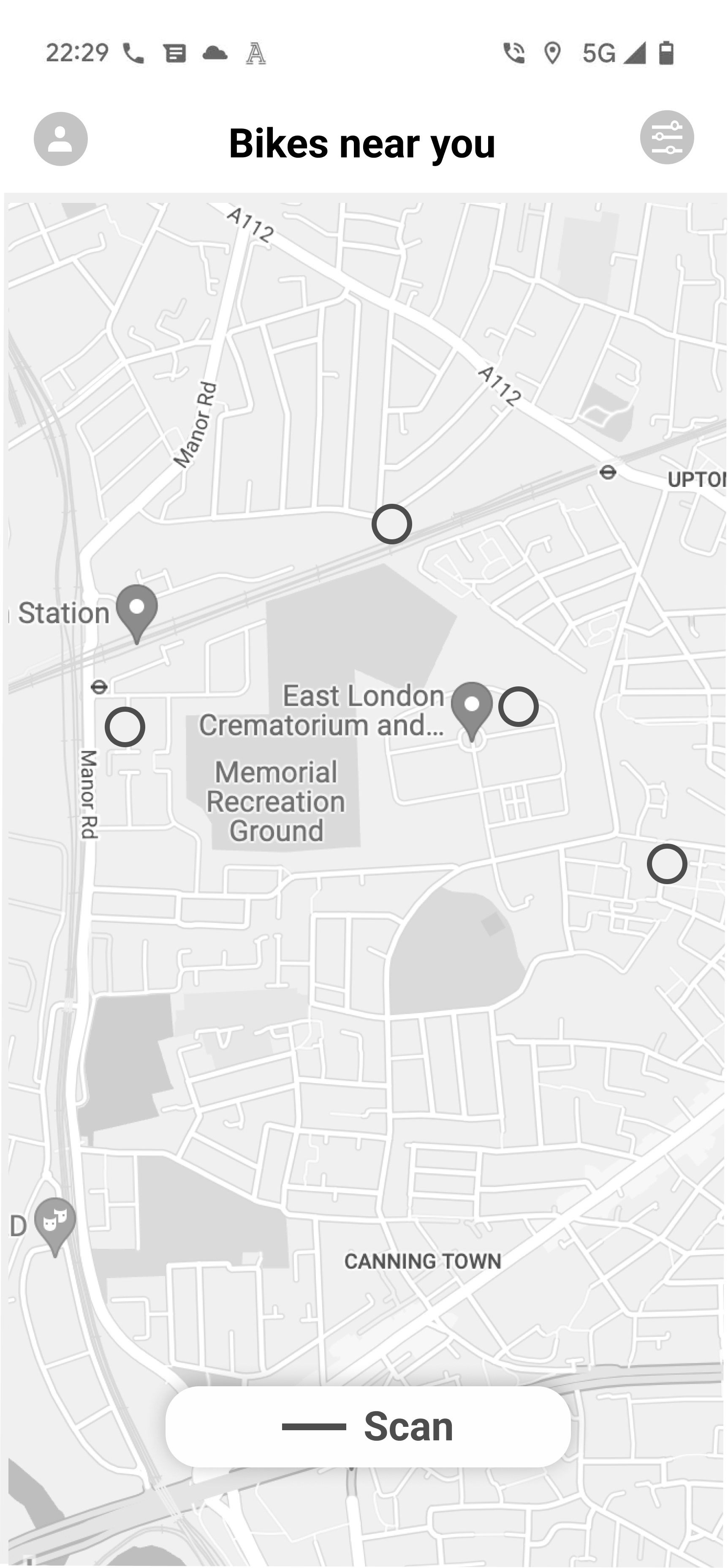
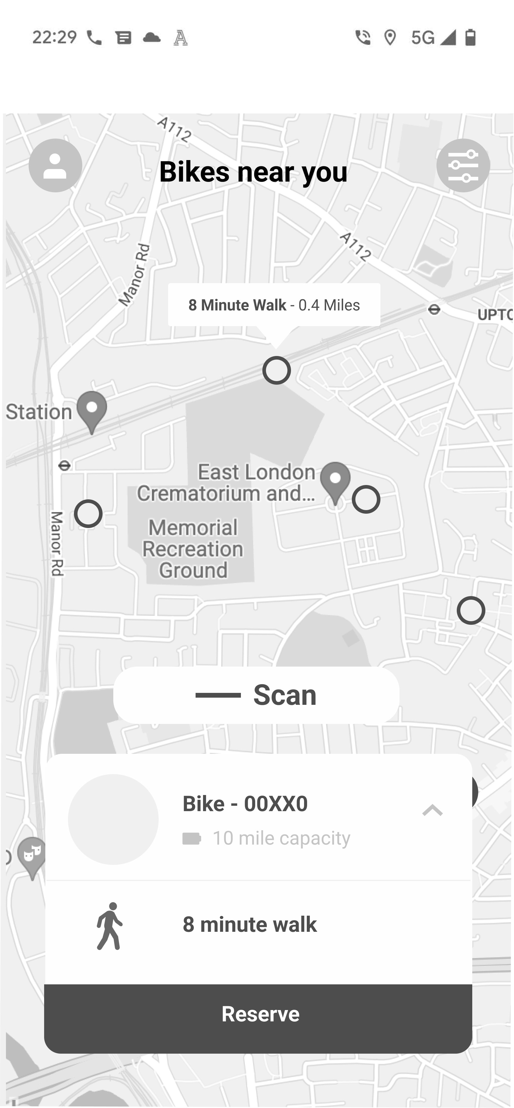
Final Screens of GoGo
Addressing issues in earlier wireframes
Implementing my mentor's feedback set me up well to push the wireframes into Hi-fi prototypes. I created a few versions of the UI before settling on the final, making sure to incoorperate feedback from stakeholders and my mentor to improve the app from both a UX and UI context. Below you can see the changes I made from the first Hi-Fi version to the one I eventually settled on for key features.
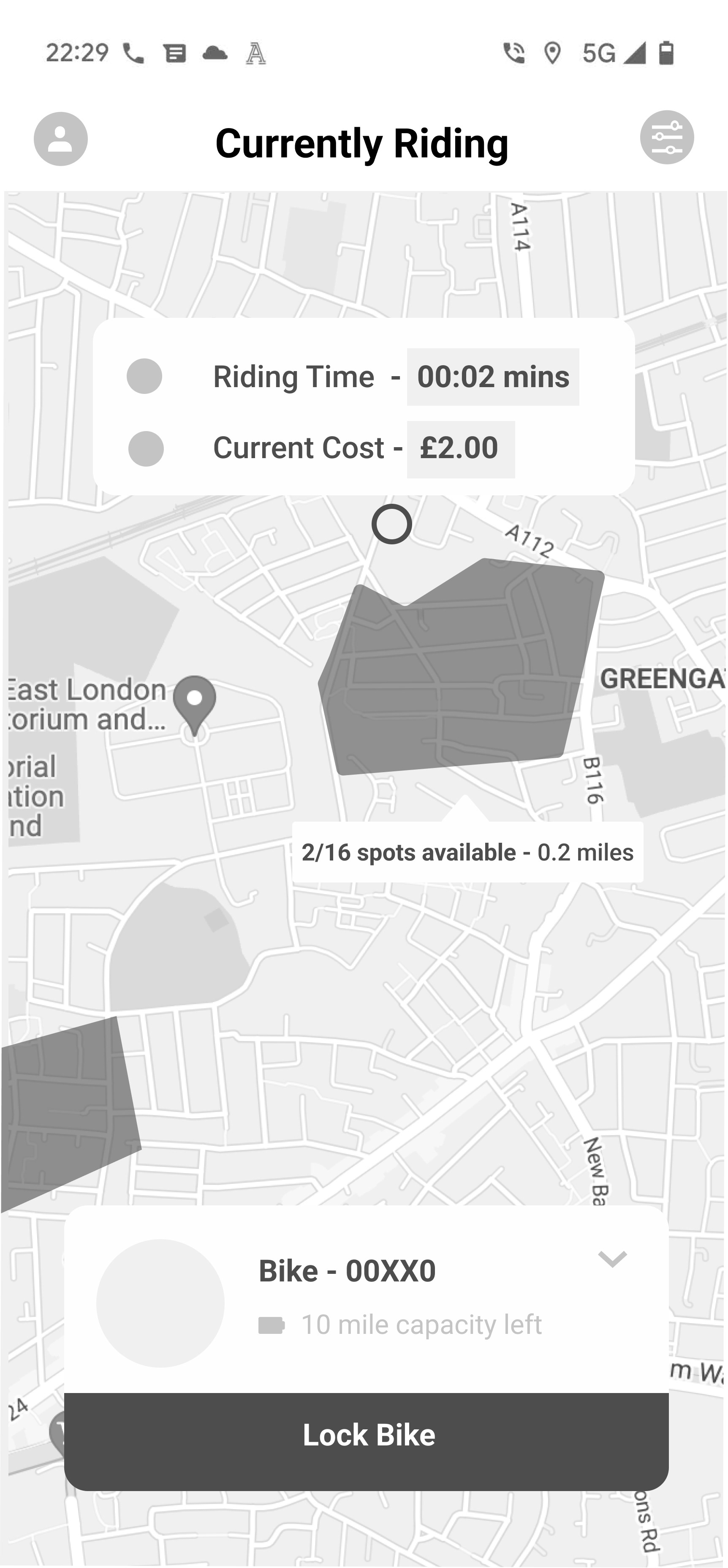
Key Feature: Ride Summary
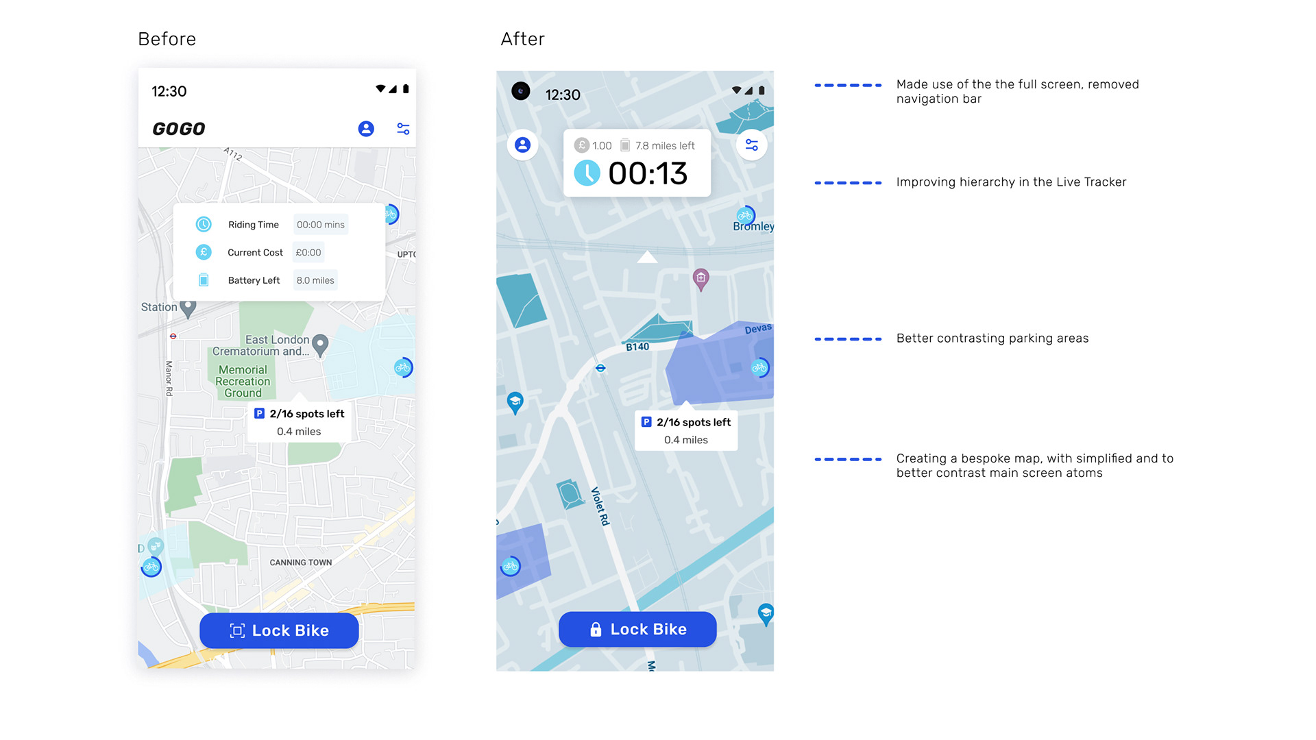
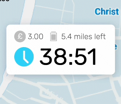
Overspending was a major issue across mutliple bike sharing platforms. Therefore based off user feedback and research I believed it was key to alleviate potential worry and reduce the risk through designing a live tracker of key data helping the user to:
- Quickly and clearly summarise how much time is left, how long have they been riding.
- Remove responsibility from the user to personally track their journey whilst riding.
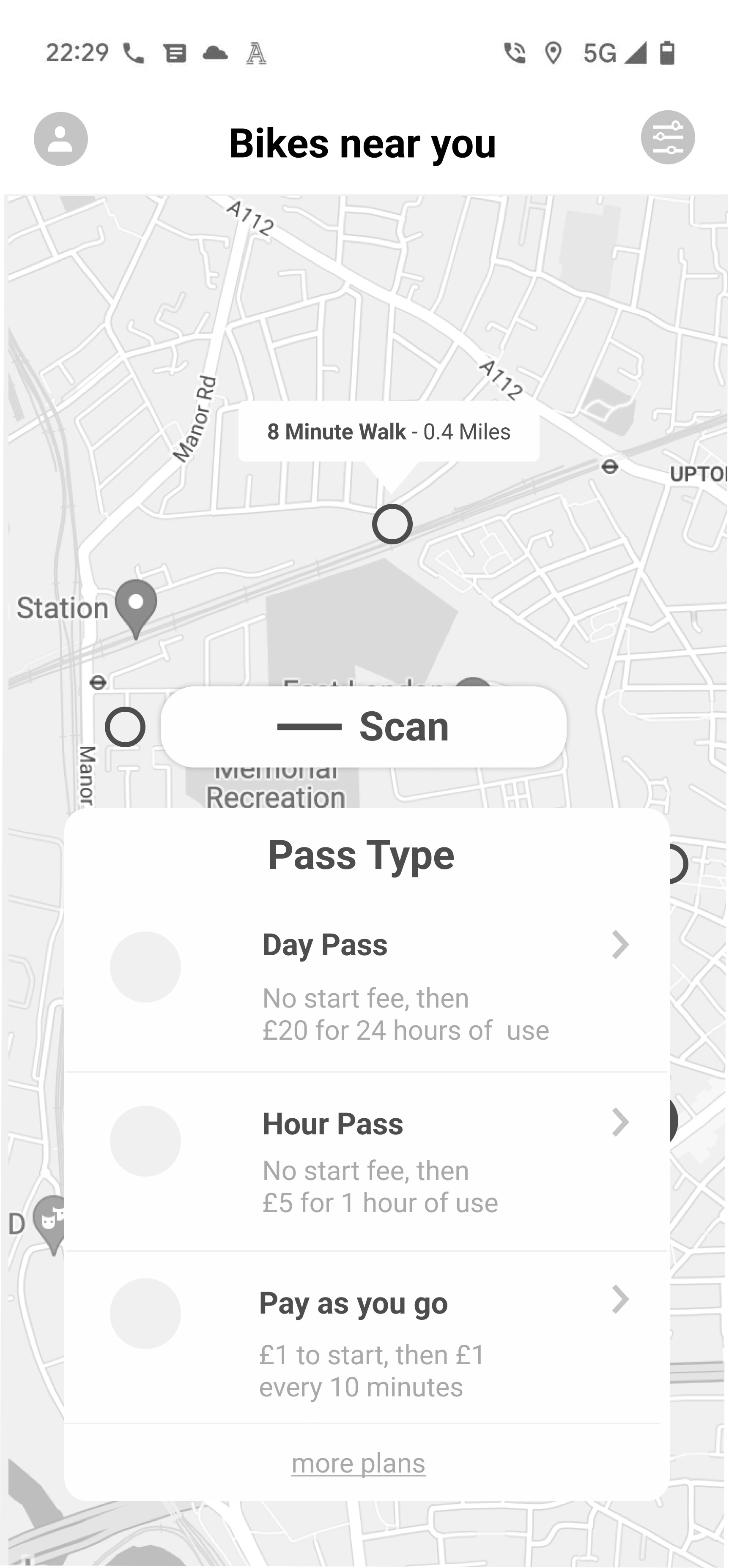
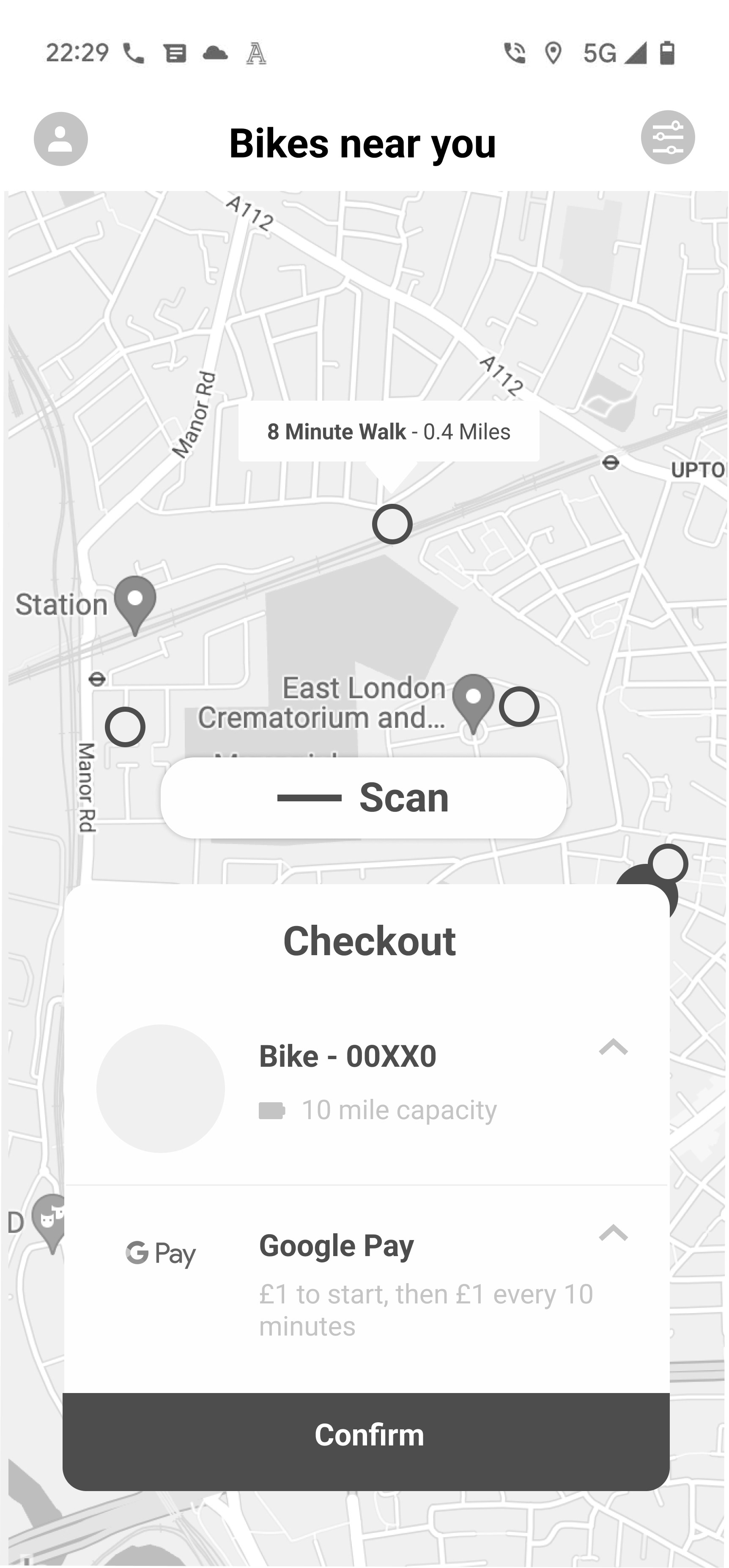
Key Feature: Checkout
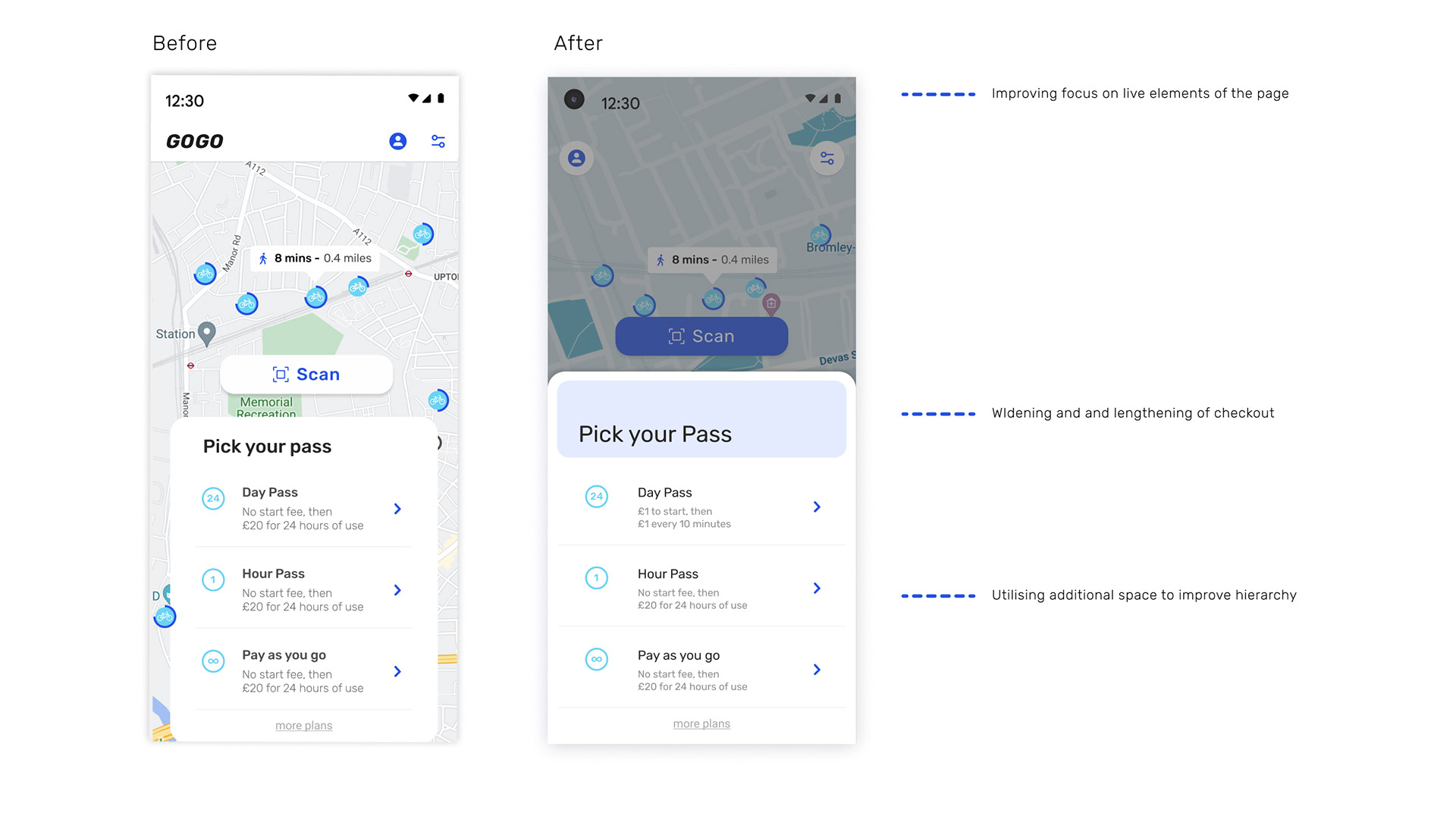
It was discovered in research that feeling assured about what exactly you’re paying for was at a high priority for a users. Hence rethinking how information would be presented in the Ride Pass interaction was a key priority and this was done through:
- Making it evident what each pass incldues via a small description of cost and time period
- Providing distinct logos to help distinguish between them at the checkout
- Readily available edit button to distinguish between choices.
- Readily available edit button to distinguish between choices.
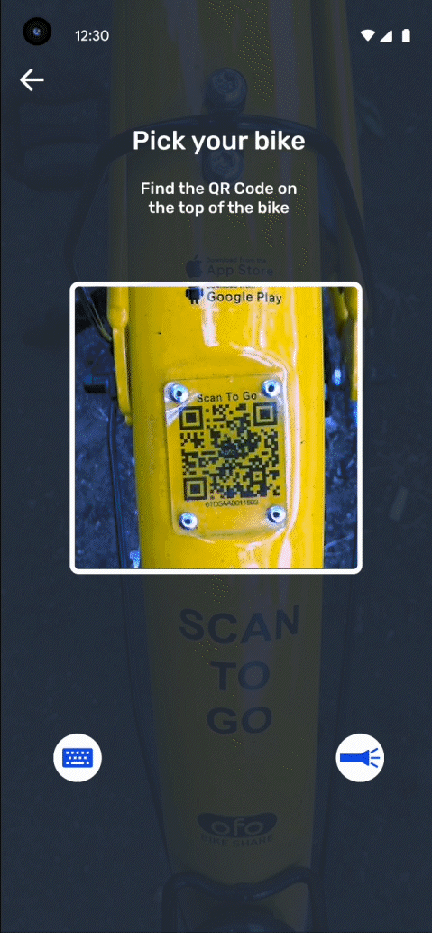
Key Feature: Information Signup
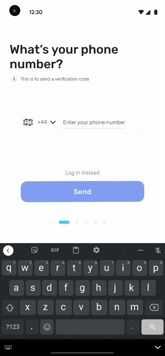
The discovery phase unearthed the fact that a lot of users rush through the sign up process without fully understanding what they are signing up to. In rethinking this process the aim was to provide users with bitesize information on what they're signing up for without disrupting the onboarding process.
Reflections
Given the time spent, I think this project was an important step in my development especially in , however going into future work there improvements I would take forward.
- I would want to incoorperate a more developed research plan that could better inform the the development of the app or even involve more co-creation in the earlier stages to better incooperate participant feedback. Using Personas that left out characteristics such as age etc, was an interesting experiment, but should took an element of storytelling out of the creative process, as there was not much to refer back to.
- I think in the future it would also be interesting to explore how a digital product or app fits within the wider context of a public system i.e how does an app like GoGo work in the context of the London Authority’s plans for Urban Mobility. I think this is quite an interesting area to explore and would provide an interesting platform to intertwine my service design skills with the skills learnt in this UX project
- I also wish I explored a wider range design directions during the wireframing phase, as I believe this would have made the refinement of the hi-fi wireframes prototypes a smoother process. A lot of time was spent changing designs in the mid and hi-fi stages which is something that could have been avoided with more consideration during the lo-fi stages of development.